Wednesday, December 24, 2008

Supergirl: Lost Daughter of Krypton 20


I keep getting the best presents this season. I was very thankful that I was allowed to borrow my friend's tablet once again as my poor little pen has been lost to the nethers and as of current has not been replaced.

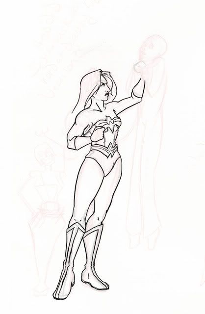
So anyway, here we have Kara and the Amateur. And there's a background (woah!) because I had so much time on my hands after having drawn the characters. It's nice to have time to think about these! (This is ironic, by the way, since I had the script for the least amount of time out of any of the episodes I've done)

I tried out about five different poses for these two, from various different angles and various different closenesses...Anything else didn't show enough or was entirely too complicated for my wee little brain.

The Amateur's costume was interesting to figure out. He had about five different costumes. I made it green because it's the easiest color to mistake for having something to do with Christmas when wearing tights (had he been in anything poofy, it would have been red). I asked Blinkie about his costume and she said he should have a mask. So I gave him one. XD That mask went through three different variations.

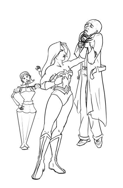
The music stage I figured could have some silly snow and note theme to it. I attempted a candy-cane thing on the eighth note, but I was having pressure sensitivity problems with the pen. Hm...I should have made the backdrop a darker color, or a more subdued color. It's meant to be a backdrop, so logically it wouldn't detract from who was in front of it so much. Oh well. XD

As for the rest of the background - I hate drawing architecture with a passion. And it's luckily a background image, so I can get away with impressionistic type things. I didn't have much patience with the people, so they became formless blobs. I put a layer of grey over the background here (which I should have done something similar for the backdrop, like I said) because there was way too much in the background otherwise.

So yeah. That's all this time!

Superman: Last Son of Krypton Issue 48


Commentary here. To all, Happy Holidays.

-Carl

Wednesday, December 3, 2008

the assassin's cover


you can see and hear more about my process and inspiration for the new cover here.

Wednesday, November 26, 2008

Supergirl: Lost Daughter of Krypton 19


Right, so here's the cover art for episode 19.

As you can see, Kara's eyes are green. Woops.

And the lemonade isn't entirely yellow.

And we're back to colored pencil, with the continued loss of my tablet pen. =sniffle= Which means that mistakes I make due to a mild case of low lighting are incredibly hard to fix. >.<

Yay for...whoever fixed Kara's eyes to blue. XD


Although I have to admit - this whole bit with the Kara pointing upwards was a result of cracking up after hearing TWIP and thorougly on purpose. It combatted with my original idea to have Kara looking out at the corn fields and have the corn fields turn into the yellow flowers. But the funny won over. >.<

Superman: Last Son of Krypton Issue 47


Hey everybody! Your commentary is here. Have a happy and safe Thanksgiving!

Thursday, November 13, 2008


Catwoman Issue 3


Hey all,


Here's my drawing for Issue 3. I did it differently than what I normally do. Usually I use photo references and draw from those. This time I drew freehand from my mind and then shaded it like I normally do. The only photo reference I used was the gun (an Uzi.)
In this scene Catwoman is sneaking around a compound in Cancun and the hoodlums below keep walking by and leaving. So I decided to go for a low view point with a close up of the hoodlum and his mean looking gun, with Catwoman in her element sneaking around the wall. Kind of like a cat walking along fences at night.
I used a B pencil to quick sketch it. Then used a 2B to outline the characters and wall. After that, I used stomps to blend in the shading and there you have it!
See ya
Paul
(next time, I'll scan the drawing step by step and post the steps.)


Friday, November 7, 2008

the Wedding episode


heres my inks for the cover. fairly simple but i liked it a lot. i meant it to be a little sexier than it turned out, her expression turned out so shy, but that's okay. i liked the subtle hatching i used, and being a female i was drawing i tried to restrain the rendering because it is really easy to over do it and make her look old or just plain ugly. but all in all i think it was very successful. you can see the colored final version on my deviantart or on the pendant website.

Sunday, November 2, 2008


Hi all,


Here's the Halloween drawing that Kristy, Kristen and I came up with. I'll post a comment shortly, and Kristen and Kristy might as well. Just posting it so everyone can take a look and see what we came up with.
Enjoy!
Paul
Ok, here's the commentary....way late.
We got together for the halloween jam and came up with the idea of putting the DC girls in each other's costumes to go out trick or treating. They all happened to meet at the same house while trick or treating. As you can see, Wonder Woman looks peeved at Catwoman wearing her costume. Catwoman looks coy wearing hers. And Kara looks like she's happy to get some treats. The kiddies are kind of surprised to see them and their costumes.
I did the pencils, Kristen did the inking and Kristy did the colouring. It was fun to jam on this. Hope to do it again.

Wednesday, October 29, 2008

Supergirl: Lost Daughter of Krypton 18


Here is the cover this month. You may notice a lot of the lines are incredibly sloppy and the line art itself is sketchy. Right, so, this week has been busy.

But on another note - you may be asking why Metallo and Kara are frolicking. It's inspired by an insinuation Steve makes. And I thought them frolicking would be funny.

As far as what I wish I had time to change (I drew this in essentially 16 interrupted hours)...the biggest problem is Metallo's hand, if you ask me. That should be properly colored. The fact that there's a lot of places where other colors cross lines they shouldn't. I should have fixed the sun in the background, and whatnot. Kara's face transgressed 6 years back to the drawing style I had in 8th grade (I guess I can blame this on being in a car (I took every moment my hands weren't doing something to work on this)).

I have to say, though. I like how the pants turned out. They /were/ the first thing I started fixing up as soon as I'd gotten the base colors down. The method I used for working on this cover were sketching out the shapes with a light blue, making another layer to draw the sketchy lineart, and then getting rid of the shapes (except I was horribly sleep deprived and didn't quite do this. The shape layer ended up on the same layer as the skin and pants). Anyways, the thing I did after laying down the colors (on varying layers depending on when I would remember to make new ones), was go through and shade with some degree of properness whilst also fixing up the lines so they weren't so sketchy and bad. And I still managed to miss a lot (particularly Metallo's hand) due to the sleep deprivation.

Which brings me to the following conclusion and moral of the story: I need to a) remember I need to draw things once a month and b) not procrastinate.

However, this was a terrible week for me to get anything done without being sleep-deprived. I just got exceptionally busy over the past four days, and have been doing my best to get it all done in time.

I also had the misfortune of losing my tablet pen about a week and a half ago, and have been searching for that frantically ever since. This cover was brought to you by the kind heart of my best friend (and her tablet-lending fantasticness).

I'll stop rambling, as now I'm trying to get a certain something else colored with as much goodness and quickness as possible. The tablet has to go back to my best friend today. (Then I have to write a script, storyboard, schedule and budget a film in a day. Oh good god).

Superman: The Last Son of Krypton, Issue 46


Commentary can be found here.

Wednesday, October 15, 2008

Catoman Issue 2. Starting over from scratch


Hiya,


So, for issue 2, I went back to what I know and am comfortable with...pencil...straight pencil... I'm happy with how this cover turned out. I thought I would draw Catwoman without her mask and costume. So now the listeners get to see what's under the mask.
She's leaning against the patio door/window looking out into the night and I decided to throw a little bit of a freudian art thingy-ma-bob in there with her eye looking like a cat's eye in her reflection...hmmmm....
Her hair was fun to do. Trying to get a nice modern, but normal type haircut.


The cat (Issus) was a little harder to draw just cause she's black. I've found that drawing black cats and dogs is more difficult than a light coloured cat or dog. I can't go too dark all over, otherwise, it looks flat and bad. So, some light shading with my kneadable eraser after the fact helps out.
Take it easy,
Paul


Wednesday, October 8, 2008

Defiant Episode 28


My 1st digital inks! I like this a lot. You can find my sketch and various stages of coloring as well as my thoughts on my blog at http://xaqbazit.blogspot.com/2008/10/vulcan-nerve-pinch.html

Sunday, October 5, 2008

Supergirl: Lost Daughter of Krypton 17


Okay, so I know this is obnoxiously late...

But Rene and I were looking on Pendant and she felt the need to comment:

"Funny sidenote guys, Supergirl's phone is an EnV2"

Or rather, based on one.

And it's based on Rene's phone, to be specific. Because hers is less complicated and looks cooler than mine.

Also, this is the first time I've touched a tablet since...well, since my Tablet PC exploded. Which was last year? A year and a half ago? Something like that.

So I apologize for the roughness. XD

Wednesday, September 24, 2008

Superman: The Last Son of Krypton, Issue 45


Hey everybody. LSOK is out. You can find my commentary here, and the image I was talking about is here.

Thursday, September 11, 2008

Catwoman Issue 1


Hi All,


Just want to say that I'm happy to be drawinng for Pendant Audio and especially the Catwoman series since I am a fan of comics with Batman being one of my favorites throughout the years.


I did this drawing in coloured pencils. Normally I just use graphite pencils
(like the Catwoman promo poster), but I decided to try colour for the first issue. I'm still practicing using coloured pencil and like Kristy (Hi Kristy), my hand hurts too. I'm happy with the final product, but I still need practice. Anyways, for the next few covers, I'm going to go back to using just pencils.


I used my Adobe Photoshop program on the computer to touch up the walls and columns and floor. But I don't have a tablet, so using the mouse was difficult.


I decided to draw Catwoman from behind just to play coy in issue 1. I thought a little bit of "booty" would be kind of funny and different for a first issue (usually it's a head on action shot of the hero/character.)


Anyways, glad to be hear and having fun looking at other's art for pendant. If you want to see more of my art, my website is http://www.paulsdrawings.com/.


Take care, have fun doodling....Paul

Wednesday, September 3, 2008

The Nest


Here's a few different versions of my cover, before the lens flair effect, with some textures i didn't use, inks etc.

Wednesday, August 27, 2008

Supergirl: Lost Daughter of Krypton 16


Hey all. So as you may have noticed, Eric's no longer doing Supergirl.

Which leaves me here. Hi! I'm Kristy. Here's my first Pendant cover. It's the first contribution I've made to Pendant that's debuted. I still have...three scripts in Seminar that haven't come out yet, and I'm in the Christmas episode of Superman as a small part.

I have no real art program on my current laptop (I have Photoshop, but that's on my very terrible and hard to use tablet PC which is ready to implode at any second, so you can understand I'd rather not try to do something on that)...

So I chose colored pencil. Because it's the best non-computer medium for me. My wrist hurts. XD I also used up my best friend's colorless blender halfway and I should just buy her a new one because she uses it as much, if not more than I do. The colorless blender is what makes all the colors pop with limited amounts of pressure with the original pencil.

Makes me wish I learned marker better. That stuff is just naturally saturated.


Anyway, if you'd like to see more of what I've drawn in the past 5 years or so... http://tregetry.deviantart.com , which has a few doodles I did to try out styles for Supergirl, and a few fanarts for Vegas (because Rene and I are really good friends, though the stuff is of Teri and Danny, which is strange because Jeff and Tessa are my favorites) ...or for some older stuff: http://dragonpixy.deviantart.com .

I shall stop rambling, mostly because I'm hungry. Once again, Hi everybody!
Hi Folks,

Just wanted to say hi and I'm glad to be blogging on the Art of Pendant as well as drawing for Pendant Audio's Catwoman. I'm very excited and I hope everyone enjoys the drawings.

Take care,
Paul

Superman: Last Son of Krypton Issue 44


Happy Wednesday everybody. You can find the commentary here.

Tuesday, August 26, 2008

2 new artists!!!

Everybody, please join me in welcoming our 2 newest members to The Art of Pendant blog. Kristy Plotkin, whom is the cover artist of Supergirl: Lost Daughter of Krypton, will have her first cover debut tomorrow along its sister show Superman: Last Son of Krypton.

Also welcome Paul Leclerc, whose work will debut with Catwoman: Queen of Thieves on September 10th.

Congratulations on landing your covers, and welcome to the Pendant family!

Friday, August 1, 2008

Superman: The Last Son of Krypton Issue 43/ Vindicatum7

I'm late. I know, I suck.


Commentary here! Thanks for listening.

Friday, July 18, 2008

Vegas 12: now with 75% more Tessa


Okay, remember how, in my last post, I promised to draw someone other than Tessa? Shortly after I posted, Jeffrey told me to read the next script. It's all about Tessa. Whoops! Well, I didn't really renege on my promise; Jeff is there, too. In the background. That counts, right?

Anyways, I knew I'd have to do this scene for the cover after I heard the preview at the end of Vegas 11. It basically popped into my head, fully-formed, and demanded to be drawn. So I did a sketch and sent it off to be approved.
Then I thought that as long as I had the file sitting there in Photoshop, I should try throwing some color on it to see what sticks. I'm not used to doing dark, dramatically-lighted scenes. And THEN I got all caught up in trying out some new CG painting techniques, and before I knew it I'd decided to digitally paint the cover.

Let's just say it's a good thing I was really ahead when I started, because I am very, very slow with CG work. CG is a double-edged sword; on the plus side, you can fix anything at almost any stage. On the minus side, you can fix almost anything at any stage. So I worked and reworked and re-re-worked it until I realized that I would eventually have to, you know, finish it.

Painting (traditional OR digital) is not my strong suit. I'm not great with color. Fortunately, I found this wonderful tutorial by Julie Dillon that made all the difference. There's some clever stuff there!

The PSD at 100%, along with the giant list of layers.

The final file, sans text and the fun grungy-book effect, was 662 mb. It's 600dpi, which is about as big as I've ever worked. It really helped, too, although it was at the limit of what my newish laptop could do. ;) There are something like 26 layers on it and it took around a minute to save. The maddening thing I discovered about the painting technique was that I couldn't really flatten any of the layers unless I wanted to flatten them down to the background; it would ruin the way the colors blended. Because of this, I ended up working on the Tessa figure in a different file to speed things up a bit.

The floor and door textures in this piece are from cgtextures.com. Big giant thanks to EK and Meghan for critiquing my works-in-progress!

NEXT TIME: I make no promises about next time. I've learned my lesson. I may try to do it in less time, though. This took me about two weeks!

Wednesday, July 16, 2008

Batman: The Ace of Detectives, Issue 30 (Vindicatum 5)!

Here 'tis, viewers. Enjoy!


Commentary is available hyaw.

~ Harley says hi. ~

Wednesday, July 9, 2008

The Reveal

Heres just the inks, since I don't have a scanner I had to take a photo, I tried to clean it up in Photoshop, but ended up leaving it a bit lighter than this, especially since the colors showed the forms so much.
This is just all the color layers in Photoshop w/o the inks, was just to show how much I colored underneath. I didn't really care for the image so I tried to beef it up with some fun colors. I think I was trying to stick so closely to the character sheet for the characters that I ended up emulating that style instead of making it my own - at least on this cover. But seeing as most were pleased with this cover, I know the next one will be even better received. I'd really like to do a close up face, some sort of emotional scene or action scene. I haven’t been drawing a lot lately and it shows. So personally, I think the covers I've done so far have been sort of stagnant or boring... But i plan to change that! And here's the final with everything together.
Oh yeah, and I also got a table so I was kind of out of my element, it was nice for a change but took some getting used to. I do like the wings though, that was fun. Until next month, -XaqBazit.

Wednesday, June 25, 2008

Superman: The Last Son of Krypton Issue 42/ Vindicatum 3

Hey folks,

Ya didn't think I'd forget aboutcha, right? Right. Anyway, Here is the cover for Superman LSOK 42/ Vindicatum 3.


My commentary is provided here! Enjoy, and thanks for listening.

Friday, June 20, 2008

Long time listener, first time cover artist

Hey guys, I just took over duties doing covers for Star Trek: Defiant, sorry I'm a little late with the post but i did have some things I wanted to share about my work on episode 25.
So being in Co on a vacation when i got the job to do the first cover, instead of in Ga where i live and have all my supplies. i didn't have the supplies i would usually draw upon, so i drew them separate and assembled them in Photoshop.

So here's a picture of the original inks.
And here's all the pieces compiled in Photoshop.

And lastly here is an early rough version of the colors.

And the final. All color layers are under the inks which have a multiply layer filter on them, and then i airbrushed the thrusters out of the back of the ship and added the lens flair on top of the inks layer.
I was very inspired by Jack Kirby's stylistic version of space, and drew allot from his old work on Silver Surfer, Fantastic 4 etc. I also drew allot of inspiration from the colors of Cam Kenedy's work on Star Wars: Dark Empire.

I had just gotten a description for the last episodes cover because I only came on board a few days before it was due but now with the longer episodes that are starting to happen with Defiant it seems the hardest part of the job will be just getting through the script in time. Looking forward to doing my first cover with the characters on episode 26, look for it by the 8th of July.

Thursday, June 19, 2008

Vegas 11 is now boarding

Hi again! Here's the cover for "Once Upon a Time in Vegas" chapter 11. It was more of a struggle this time, but I think it turned out well in the end. I wasn't intending on doing another Tessa cover, but I thought this scene would work out best. I'll draw someone else next time! Promise!

The cover was colored in Photoshop this time around; I had a time crunch, I still need to replace some markers, and I needed to tweak the drawing a lot. This worked out well because I got to play with the colors a lot more in PS than I'd have been able to with marker. I actually colored everything but Tessa in various grays, and then ended up with the sepia tone after playing around with an adjustment layer. (What's an adjustment layer? Check out this video tutorial to find out.)

I got a kick out of drawing O'Hare, by the way. I know airport gates are generally the same everywhere, but O'Hare is my "home" airport. Thanks, Rene and Alicia, for putting that little detail in. ;)

Wednesday, June 11, 2008

Batman: The Ace of Detectives, Issue 29 (Vindicatum 1)!

Excited about part 1 of Vindicatum yet? No? Well, get excited, darn it! And then you can take a look at the cover I made:


Commentary is available, and may be found at: http://www.zshare.net/audio/134741756786567c/

The sketch which I mention in the commentary may be viewed on my DeviantArt account here.

~ Harley says hi. ~

Tuesday, June 3, 2008

The Kingery Episode 2x02


I went back to a more traditional look with this one but I forgot to keep the logo placement in mind so his hands ended up being completely covered. Oh well . . . to err is human etc. etc.

Friday, May 30, 2008

Once Upon a Time in Vegas #10


Hi everyone! Sorry this is a little late. I was working a convention the weekend this episode came out, and I am just now crawling out from the rock I was hiding under post-con.

This is my first cover for Vegas, although it's not my first Pendant work. I also did the promotional poster for Dixie Stenberg. Both Dixie and this Vegas cover are done in Copic marker on Bristol board.

Anyways! The lovely ladies behind Vegas requested a pulp novel look, which got me really excited. I love vintage art, and pulp novels are no different. I used a lot more blacks and greys than normal in order to emulate the cheap printing method of old pulp novels. This cover also had a lot of Photoshoppin' done to it; some of the markers I was using up and died on me and so I Photoshopped in some of the background. I'm not telling where!

After I finished the main art, I needed to age the cover. Bright clean marker colors aren't very convincing as a 50-year-old book. I used some stock textures and Photoshop brushes to beat up the image a bit.

One more thing I worked on was aging the logo. Paper tends to yellow over time, and inks fade. I putzed around a bit until the logo looked as old and yellow as the rest of the image.

Finally, I dug up a font that had some of the vintage look of pulp novels. The cover uses a slightly tweaked Gill Sans Condensed. I crossed my fingers that Jeffrey wouldn't kill me for being so picky and was done! Here's the end result.

I had a lot of fun working on this cover. I'm looking forward to blabbing about the next one!

Wednesday, May 28, 2008

Superman: The Last Son of Krypton, Issue 41


How's it goin' everybody? Issue 41 is up and running. You can hear my commentary for this cover here. I really enjoyed this cover. It's got a nice, sinister feel to it. Enjoy!

Tuesday, May 20, 2008

Two, count 'em, TWO new artists!

We're growing so much, you'd think we're on HGH (we're not, LOL)! Please join us all in welcoming Rebecca Hicks (yeah, I'm a little late on that, I suck) whom is doing the cover work for Star Wars: Blue Harvest, and Loran Skinkis whose art debuts with Seminar this Friday. Look forward to seeing their artwork displayed here along with their commentaries.

Welcome aboard!

Thursday, May 15, 2008

Yet, another new member!

Please join me in welcoming Julie Lindsey to the Pendant Artists family! Julie is the artist for Once Upon A Time In Vegas, with her newest cover premiering with Vegas #10 tomorrow! Keep checking back with us as she will be posting her artwork and providing commentary.

Welcome aboard, Julie!

Wednesday, May 14, 2008

Site Maintenance

If some of you were on here earlier today, you may have noticed the banner was replaced with a black rectangle for a short period. I was checking size ratios for the new banner I was working on.

I decided to reconstruct the banner for a few reasons.

a.) I felt the image sizes were too small.
b.) I decided to put the images in reverse chronological order [oldest release image on your left, to newest release image to your right].
c.) We will be welcoming aboard a few new artists in the near future (more on that soon) and at the current size, I couldn't fit any more on there, so rotating the images chronologically made sense to me.

It's all finished now. Sorry for the inconvenience.

Batman: The Ace of Detectives, Issue 28!

Greetings again, all. Been a while since I made a post, I know, but there isn't a whole lot one can do on this blog in between covers that won't invoke the wrath of the Spoiler Dahaka (even worse than the Assassins!). To that end, here's the cover for 28, before it got all Pendantized:


Commentary, as always, is available, and can be found at the following address: http://www.zshare.net/audio/11992353e418721a/

I'll have something to show you again—hopefully, sooner rather than later this time.

~ Harley says hi. ~

Saturday, May 10, 2008

Dixie 22!


I suppose I should talk about this, ne? I drew the thumbnail for this while at work, which was really just a scribble of robot zooming out of a triangle that had an arrow pointing to it which said "Why are you yet again drawing modes of transportation? You suck at drawing modes of transportation." And dont say that I dont. If you see a large inanimate object drawn by me, there is a very good chance that it's been drawn from a reference, or sometimes even outline traced. I'll do my own detail work once I have the general shape of it, though.


So, this cover. I did the thumbnail at work a week ago. Figured "I'll do it when I get home" then it slipped my mind. Time passes. I'm sitting on my couch Sunday (the day before release) going "What do I want to do today? I know! I can go see Iron Man again!" then I remember "Crap... I have a Dixie cover due!!" So I start hunting online to find a sutible war era allied submarine that I can reference. I found one, got it all drawn and it looked AWESOME. Really clean lines. Drew Robot, who I actualy dont need a reference for as there is an easy trick with her since she's so geometric. All her detail looked awesome, I positioned her where I wanted her to be to look like she was being torpedoed, I went to merge the Sub line art and the Robot line art AND....


I hit Control + W instead of Control + E. When it popped up asking if I really wanted to close the window, my cursor happened to be over the "no, dont save changes" button and.... Bye bye robot and sub. ::SIGH:: So I started all over, and I didnt spend as much time because at this point it was 10:30 at night. So where before I might have spent an hour on making sure all the lines were strait on Robot and the sub, I spent about 20 minutes just to get it on the page. Coloring on both Robot and the Sub were done using a nifty effect, which I tend to use anytime I need to draw metal, that uses feathering and levels and layer effect embossing. I then did my super secret under water effect (ok, I randomly drew lighter blue streaks coming down from the top of the screen, then did dodges to put in lighter streaks and put the streaking layer infront of the sub but behind Robot.) I've spent a fair amount of time under water (SCUBA!) so I know how light works filtered through 100 feet of ocean. Paint in some bubbles for motion, then all that was left was to put the Umket add together, position the episode title and credits so that they arent in the way of the art, then ship it off to Jeffrey. I finished at about 2 in the morning, but I'll admit that I was heavily distracted, as well, by people IMing me.


Monday, May 5, 2008

The Kingery season 2 episode 1


First post jitters so please forgive me. I don't really have much to say about this one. I had fun getting to paint Madeleine for the first time and designing the uniforms of the officers. Other than that, I tried a different approach to this painting than I have used on the previous ones. For this one I tried to pretty much wing it as I went along and keep it loose. I learned a few more things about digital painting in the process, but i doubt that I'll work this way again on future episodes.

Friday, May 2, 2008

A new member of the blog!

Please join us in welcoming Nick Hadley to The Art of Pendant blog. Nick has been the artist on The Kingery since the beginning of the show, and will post his final piece for today's release in the near future.

You'll find a smaller version of his work in the banner on the far right.

Welcome aboard, Nick.

Wednesday, April 30, 2008

Superman: The Last Son of Krypton, Issue 40


I absolutely could not wait to get into making this cover. I read the script at the very least 5 times, and each time it blew me away.

For this issue it could've been a very clean cut shot of Krypton exploding, but I felt that it wouldn't elicit a proper reaction. It is implied in the act of Krypton exploding that everybody dies, and it's sad, but you don't really feel the weight of it until you see the toll it takes on Jor-El and Lara.

As for the technical aspects, Jor-El and Lara were inspired in part by Superman: The Movie. They were drawn and inked, then scanned into Photoshop and then colored.

Krypton was originally drawn but I couldn't get the effect I wanted, so I found a tutorial on how to make exploding planets. Krypton itself is actually a pic of dried mud worked through Photoshop to get the end result.

Until next time.

Wednesday, April 23, 2008

Wonder Woman: Champion of Themyscira Issue 27


WOOT! My first post! Why? Because I'm too lazy to comment on old issues covers for Dixie and Wondy. This issue marks my twelfth cover on COT! Go me! The original pencils were done in all red with a red, erasable colored pencil. Why? Not because I had some art reason, but because it was all I could find when I sat down to draw that day. You can kind of see the original pencils HERE, but they are faint.
I scanned them into photoshop, made them their own layer, then dialed down their optipacity to 20% or so so I could start inking. You can see the finished inks Here. To color it, I made a new layer, filled it all with a medium pinkish hue, then used a yellowish orangy hue and a blended airbrush brush with the optipacity at 30% and Flow at 20% or so. I then painted. It's hard to explain other than that. Maybe one day I'll make a screen captured video so you can see it. I've done the digital painting technique a couple of other times, and those always end up being my favorite covers, but it takes a really long time.

Here are the finished colors for Diana, Ironsides, and Mabel. And if you look closely, yes, Mabel is drawn almost identical to Nebulon. Haha. I win. Well, no. Susan wins for making the reference in the first place. I then drew the lasso and shaded it though clever usage of inner glow, outer glow, and bevel/emboss. Yay, filters! I agonized over the background and ended up using a stock photo reference then making it look trashed. I hate back grounds. And now, the completed!!


Supes 41 progress

I have the 3 main components drawn and have the base colors put down in photoshop. All in all I'd say that I'm about half way there.

One week until Superman 40!

Friday, April 18, 2008

Nat Irons

No real progress to speak of in terms of the new cover since I had been sick, but I figured I'd post the character design I did for Nat to prepare me for Superman 38. If you look close enough, you can still see part of the "wire frame" or "skeletal system" I used for the figure.

I don't think I changed that much. I took off the metal hair, added the shoulder guards, and took off all the "up & down" arrows on her helmet and shoulders and instead put them on top of her gloves.
Other than that, I don't think I changed much.

Wednesday, April 16, 2008

Batman: The Ace of Detectives, Issue 27!

All right. I said a crap-ton more in my audio commentary than I'd ever care to type, so why don't you head on over there and listen to the (nearly half-hour) of self-indulgent madness. I'll even give you a little trivia about each and every character in the pic, too, so it won't be a total time-sink for you!

Commentary for this cover is available here: http://www.zshare.net/audio/10648528b6114d46/

Tuesday, April 15, 2008

It's go time

I got word back from Jeffrey what cover he wanted. A wise choice, if I do say so myself. I will start the actual penciling and inking in the next day or so.

I will post more about it as needed.

Until next time, Gadget. NNNNNNEXT TIIIIIIIIIIIIIIIME! *muahahaha*

Monday, April 14, 2008

The Waiting Game

I just finished reading the script for Superman 41 and made some thumbnails (coming from a Graphic Design background, that's how I'm used to doing it) for Jeffrey to look at. He'll then give me the go ahead on which one he wants and I'll go from there.

I'll post more about it as I progress on the cover.

Sunday, April 13, 2008

Pendant Preview: Batman: The Ace of Detectives, Issue 27!

This is non-spoilery, so no one needs to worry about the Assassins. Just thought I'd show you my first couple of sketches for the Batman 27 cover—the final cover, by the way, looks nothing like these. My first thought for the cover, since it is essentially the end of this story arc, was to show various scenes and/or characters from the past episodes. Thus, we begin with this:


A GCPD badge and a spent shell casing; a small grouping of Harley (my first attempt at her), Riddler, and Mr. J; and a rather odd-looking Dr. Hugo Strange.

I thought M. Siero Garcia, the voice behind GCPD Detective Renee Montoya, might like this sketch of Montoya I did in anticipation of a "flashback" sort of cover. In my humble opinion, it looks a heck of a lot better than the Montoya who appeared on my Batman 25 cover—but that's just me.


And finally, the last sketch before I got my new idea—a scene from what I believe was episode 5 of TAOD: Harley, Riddler, and Joker standing around just after Riddler put the ol' lead to Misty's boyfriend Bill Vogel. Catwoman's peeking in through the window there. There's nothing I really like about this particular piece—it's my second attempt at Harley, and she looks half-decent. Joker looks old, Riddler just looks...no...and this marks my first attempt at Catwoman, which is just all right, in my opinion.


I meant for there to be a blood spatter on the wall under the window. That would've been taken care of with a custom Photoshop brush from a DeviantArt user. I would've added a little smoke from the gun there as well.

So there you go. Those are bits from my first few cover attempts on Batman 27. The final product, which I have finished and sent off to Jeffrey for full Pendantization, will be made available here, Pendant's site, my personal journal, and my DeviantArt account on Wednesday.