

Okay, remember how, in my last post, I promised to draw someone other than Tessa? Shortly after I posted, Jeffrey told me to read the next script. It's all about Tessa. Whoops! Well, I didn't really renege on my promise; Jeff is there, too. In the background. That counts, right?
Anyways, I knew I'd have to do this scene for the cover after I heard the preview at the end of Vegas 11. It basically popped into my head, fully-formed, and demanded to be drawn. So I did a sketch and sent it off to be approved.
 Then I thought that as long as I had the file sitting there in Photoshop, I should try throwing some color on it to see what sticks. I'm not used to doing dark, dramatically-lighted scenes. And THEN I got all caught up in trying out some new CG painting techniques, and before I knew it I'd decided to digitally paint the cover.
Let's just say it's a good thing I was really ahead when I started, because I am very, very slow with CG work. CG is a double-edged sword; on the plus side, you can fix anything at almost any stage. On the minus side, you can fix almost anything at any stage. So I worked and reworked and re-re-worked it until I realized that I would eventually have to, you know, finish it.
Painting (traditional OR digital) is not my strong suit. I'm not great with color. Fortunately, I found this wonderful tutorial by Julie Dillon that made all the difference. There's some clever stuff there!
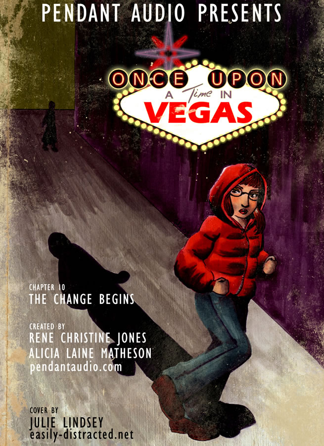
 The PSD at 100%, along with the giant list of layers.
The final file, sans text and the fun grungy-book effect, was 662 mb. It's 600dpi, which is about as big as I've ever worked. It really helped, too, although it was at the limit of what my newish laptop could do. ;) There are something like 26 layers on it and it took around a minute to save. The maddening thing I discovered about the painting technique was that I couldn't really flatten any of the layers unless I wanted to flatten them down to the background; it would ruin the way the colors blended. Because of this, I ended up working on the Tessa figure in a different file to speed things up a bit.
The floor and door textures in this piece are from cgtextures.com. Big giant thanks to EK and Meghan for critiquing my works-in-progress!
NEXT TIME: I make no promises about next time. I've learned my lesson. I may try to do it in less time, though. This took me about two weeks!

